library(wbstats) # the World Bank data downloading
library(dplyr) # data manipulation
library(tidyr) # data manipulation
library(purrr) # data manipulation
library(ggplot2) # data visualization
library(sf) # spatial data manipulation
library(rnaturalearth) # access to spatial data
# devtools::install_github("mtennekes/tmap")
library(tmap) # spatial data visualizationGlobal socio-economic data is easily accessible nowadays. Just type the indicator of interest and the name of the country in your preferred search engine and you can find its value, sometimes also an additional plot or a map. But what about when you want to go further and (for example):
- Want to compare many countries?
- Get data just for a specific year?
- See changes in time?
- Just want to create a very specific plot or a map?
In this blog post, I will show how to download, process, and present global socio-economic data, using the following packages:
World Bank Data
The World Bank Data is a source of various global socio-economic indicators with a large database of historical records. Its API is, for instance, accessible through the R package wbstats package. The two most important functions of this package are wbsearch() and wb(). The first one allows for searching for available indicators, and the second one is used for downloading the data. Read the vignette “wbstats: An R package for searching and downloading data from the World Bank API” to learn more about this package.
Here, I would like to create a time-series of a selected indicator. The function below downloads data for a given indicator and a year. Secondly, it selects only the variables of interest and reshapes them into the wide format.
wb_data_create = function(indicator, new_name, year, ...){
  df = wb(indicator = indicator,
          startdate = year, enddate = year, ...) %>%
    select(iso_a2 = iso2c, value, year = date) %>%
    mutate(indicator = new_name) %>%
    spread(indicator, value) %>%
    as_tibble()
  # return the dataframe
  df
}
Importantly, this function can be also used to download data from many years using the map_dfr() function. As an example, let’s download a data of life expectancy at birth for every five years from 1963 to 2013 on a country level:
data_life_exp = seq(1963, 2013, by = 5) %>%
  map_dfr(wb_data_create,
          indicator = "SP.DYN.LE00.IN",
          new_name = "life_exp",
          country = "countries_only")
This new dataset, data_life_exp, already allows analyzing temporal changes in life expectancy. For example, we can calculate the mean life expectancy of all countries:
data_life_exp_avg = data_life_exp %>%
  group_by(year) %>%
  summarise(mean_life_exp = mean(life_exp, na.rm = TRUE))
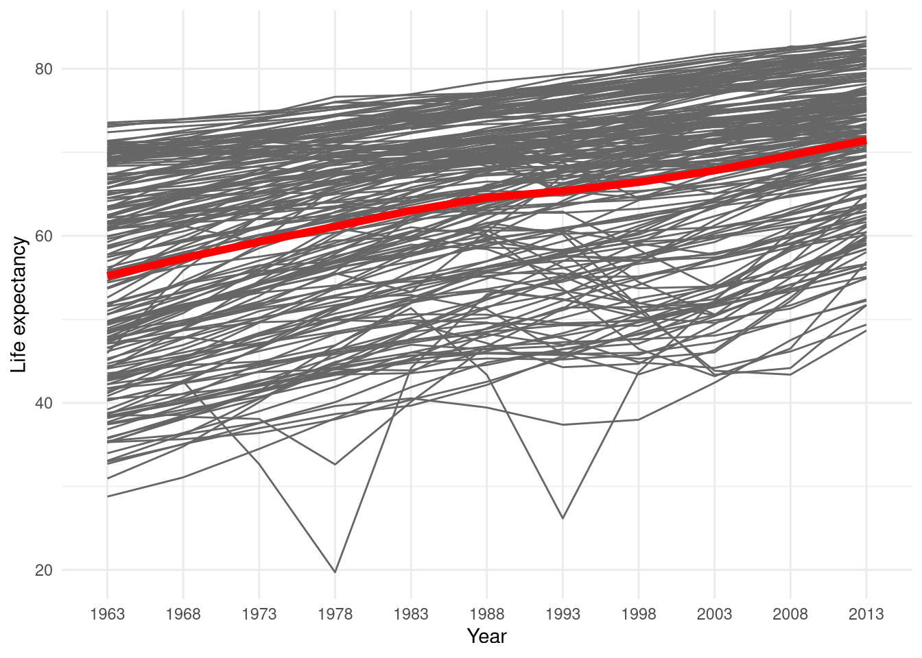
Let’s visualize the life expectancy. Each grey line represents one country, and the red one shows the mean life expectancy.
ggplot() +
  geom_line(data = data_life_exp,
            aes(year, life_exp, group = iso_a2),
            color = "gray40") +
  geom_line(data = data_life_exp_avg,
            aes(year, mean_life_exp, group = 1),
            color = "red", size = 2) +
  labs(x = "Year", y = "Life expectancy") +
  theme_minimal()
Spatialize it
Overall, we can see a stable increase in life expectancy over the last 55 years. However, are there any differences between countries? What is the spatial distribution of the life expectancy? To answer that, we can download spatial data of the world using the rnaturalearth package:
world = ne_countries(returnclass = "sf") %>%
  select(iso_a2, name_long, continent)
Next, we need to combine the new spatial data with our non-spatial information of life expectancy. First, the non-spatial data is reshaped into the wide form. This way we are filling missing data with NA instead of removing them As a result, we will have the same number of countries (borders) for each year in our database. Secondly, we are joining the spatial world dataset with the non-spatial data_life_exp_wide using the variable "iso_a2" common to both datasets. The last step is to convert the data back into a long form, where each pair of country and year corresponds to one row. This also means that the spatial geometry for each country will be repeated for each time step.
data_life_exp_wide = data_life_exp %>%
  spread(year, life_exp)
world_temporal = world %>%
  left_join(data_life_exp_wide, by = c("iso_a2")) %>%
  gather(year, life_exp, `1963`:`2013`)
Facet map
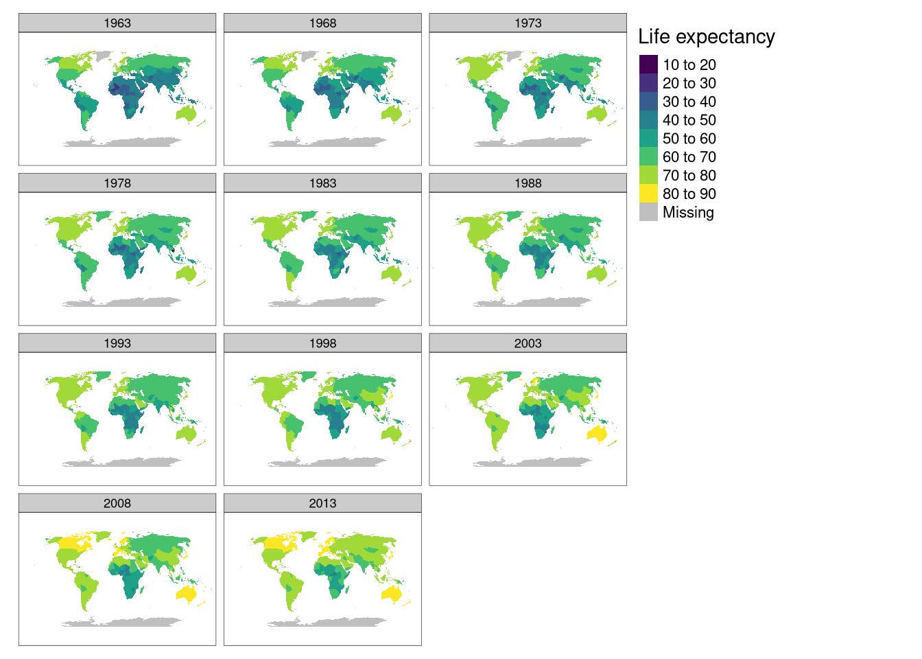
How to create a map showing temporal changes? One of the most straigforward ways is to use a facet plot:
robinson_projection = "+proj=robin +lon_0=0 +x_0=0 +y_0=0 +ellps=WGS84 +datum=WGS84 +units=m no_defs"
my_map = tm_shape(world_temporal, projection = robinson_projection) +
  tm_fill("life_exp", title = "Life expectancy",
          palette = "viridis") +
  tm_facets(by = "year", ncol = 3)
my_map
Each map facet represents a different year. We can see that, on overall, the map colors shift from darker to more bright, indicating an increase in life expectancy. There is a noticeable spatial similarity (“spatial autocorrelation”) - European countries tend to have a longer life expectancy, while the lowest life expectancy is in Africa. This visualization also reveals (or just helps to see) a lot more, for example, life expectancy in China increased visibly faster than in neighboring countries or that there are missing values for Greenland before 1978.
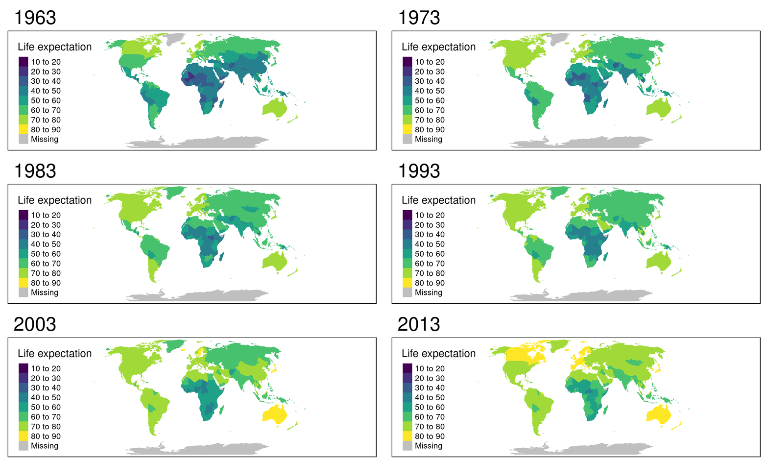
There is, however, a downside of facet maps - each facet is relatively small and it is hard to see any details without zooming in. Alternatively, an animated map can be created, where each facet would be a next image frame.
Animated map
The code to create an animated map is almost identical to the facet map code. There is only one important difference - the along parameter should be used instead of by:
my_ani = tm_shape(world_temporal, projection = robinson_projection) +
  tm_fill("life_exp", title = "Life expectation",
          palette = "viridis") +
  tm_facets(along = "year")
The output, my_ani, is a set of maps - one map per year. It can be further converted into a proper animation with the tmap_animation() function:
tmap_animation(my_ani, filename = "life_exp_animation.gif",
               width = 1500, height = 600, delay = 60)
The output presents the animated changes in life expectancy. The overall trend is still visible, but also small changes can be seen. It includes, for example, decreases in life expectancy in Cambodia in the 1970s and Rwanda in the 1990s.
Bonus
It is also possible to combine the two above methods - facet and animated map. Let’s try it on the data from South America:
world_temporal_sa = filter(world_temporal,
                           continent == "South America") %>%
  na.omit()
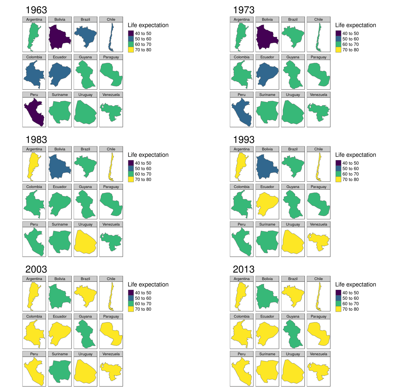
To enable animated facet map, both arguments - by and along need to be set. Here, countries will be presented on facets and each animation frame is a different year. Feel free to test what would happen if you switch the arguments of by and along.
my_ani2 = tm_shape(world_temporal_sa) +
  tm_polygons("life_exp", title = "Life expectation",
          palette = "viridis") +
  tm_facets(by = "name_long", along = "year", nrow = 3)
tmap_animation(my_ani2, filename = "life_exp_sa_animation.gif",
               width = 1600, height = 1000, delay = 60)
This way of presentation has a nice property - it allows for focus on values, instead of countries location or size. You can easily see values of the smallest countries and compare them to the largest ones.
I must admit that the bonus visualization example might not be the most appropriate. This visualization method is the best suited for comparing continuous features. For example, imagine animated facet maps comparing continuous surface phenomena (e.g. temperature or air quality) for each country through time. Try this method for yourself!
Final words
This blog post builds on the content in Chapter 8 of the book Geocomputation with R. To learn more about spatial data analysis, visualization and modeling using R visit the online version of the Geocomputation with R book at https://geocompr.robinlovelace.net/.
Acknowledgement
I’d like to thanks to Tal Galili (creator of https://www.r-bloggers.com/ and https://www.r-users.com/), and Maëlle Salmon, Bruce Zhao, Colin Fay, Eric Nantz, Hao Zhu, Jasmine Dumas, Jon Calder, Jonathan Carroll, Kun Ren, Tracy Shen, Wolfram Qin (team members of https://rweekly.org) for doing a great work of gathering and spreading blog posts, tutorials, and many other R-related resources. Keep your awesome work!
Reuse
Citation
@online{nowosad2018,
  author = {Nowosad, Jakub},
  title = {Life (Expectancy), Animated},
  date = {2018-07-05},
  url = {https://jakubnowosad.com/posts/2018-07-05-life-expectancy-animated/},
  langid = {en}
}
