library(sf)             # spatial data classes
library(rnaturalearth)  # world map data
library(readxl)         # reading excel files
library(dplyr)          # data manipulation
library(tidyr)          # data manipulation
library(purrr)          # data manipulation
library(cartogram)      # cartograms creation
library(tmap) # maps creationLast month, Max Roser presented a cartogram of the Earth’s population in 2018. He also provided some perspectives on its spatial distribution in an article on the worldinourdata.org, which I recommend. Links to the article were shared in many places, including in the blog post A Map of the World Where the Sizes of Countries Are Determined by Population. The author, Jason Kottke, concluded with a wish:
“I would love to see an animated version of this cartogram from like 1950 to 2100”.
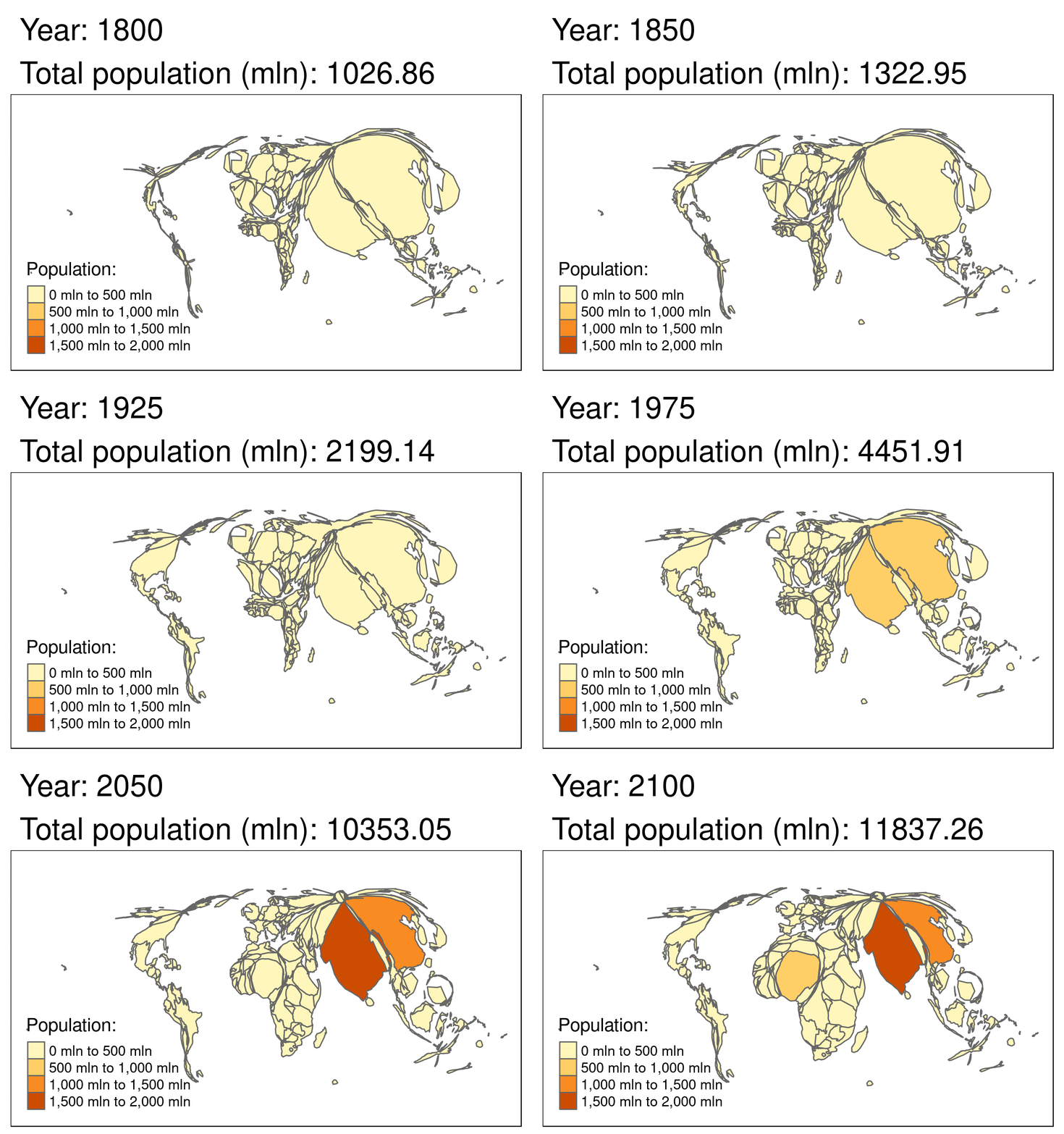
Why not from 1800 to 2100? And why not do it using open data and open source software, so that anyone can reproduce the results? That is the aim of this post. In it, we will see how to generate the animated cartogram illustrated below.

The above animation was created using open data (from gapminder.org) and open source software (R, which can be downloaded from r-project.org). This means not only that you can reproduce the results. You can also change (for example to create yearly changes instead of changes every 25 years) and potentially improve them.
Described in the book Geocomputation with R, which helped inspire this post, this is how open source software works: someone writes code that does something useful and the community contributes to make it even better.
The rest of this post is more focused on the code. I will explain how the steps involved in making the above animation, and, in the final section, link to more comprehensive teaching material that will teach not only how to make a multitude of other types of maps in R, but also how to ensure the results are reproducible.
The first stage is to prepare the data.
Prepare
Let’s start with the packages. If you are new to R, you may want to take a read of this first, which points to various resources for setting-up R for geographic data. When you have a recent R version and the appropriate packages installed (e.g. by executing devtools::install_github("geocompr/geocompkg")) the packages can be attached as follows:
Data
To create cartograms of the world population for each year we will need two datasets - one containing spatial data of the world’s countries and one non-spatial with information about the annual population in the world’s countries. The first one can be easily downloaded from the Natural Earth website, for example using the rnaturalearth package:
world_map = ne_countries(returnclass = "sf")The second one is available from the Gapminder foundation. Gapminder provides a dataset with population data for all countries and world regions from 1800 to 2100. We can download and read the dataset using the code below:
if(!dir.exists("data")) dir.create("data")
download.file("http://gapm.io/dl_pop", destfile = "data/pop1800_2100.xlsx")
world_pop = read_xlsx("data/pop1800_2100.xlsx", sheet = 7)
Cleaning
As always when working with multiple datasets - some data cleaning will be necessary. Our world_map dataset has many columns unnecessary for cartograms creation and we do not need spatial data of Antarctica. Let’s get rid of them. we can also transform our data into a more appropriate projection1.
world_map = world_map %>%
  select(sovereignt) %>%
  filter(sovereignt != "Antarctica") %>%
  st_transform(world_map, crs = "+proj=robin")
We need to have a common identifier to combine our spatial and non-spatial datasets, for example, names of the countries. However, there are inconsistencies between some of the names. We need to fix it manually:
world_pop = world_pop %>%
  mutate(sovereignt = name) %>%
  mutate(sovereignt = replace(sovereignt, sovereignt == "Tanzania", "United Republic of Tanzania")) %>%
  mutate(sovereignt = replace(sovereignt, sovereignt == "United States", "United States of America")) %>%
  mutate(sovereignt = replace(sovereignt, sovereignt == "Congo, Dem. Rep.", "Democratic Republic of the Congo")) %>%
  mutate(sovereignt = replace(sovereignt, sovereignt == "Bahamas", "The Bahamas")) %>%
  mutate(sovereignt = replace(sovereignt, sovereignt == "Serbia", "Republic of Serbia")) %>%
  mutate(sovereignt = replace(sovereignt, sovereignt == "Macedonia, FYR", "Macedonia")) %>%
  mutate(sovereignt = replace(sovereignt, sovereignt == "Slovak Republic", "Slovakia")) %>%
  mutate(sovereignt = replace(sovereignt, sovereignt == "Czech Republic", "Czechia")) %>%
  mutate(sovereignt = replace(sovereignt, sovereignt == "Congo, Rep.", "Republic of the Congo")) %>%
  mutate(sovereignt = replace(sovereignt, sovereignt == "Kyrgyz Republic", "Kyrgyzstan")) %>%
  mutate(sovereignt = replace(sovereignt, sovereignt == "Lao", "Laos")) %>%
  mutate(sovereignt = replace(sovereignt, sovereignt == "Swaziland", "eSwatini")) %>%
  mutate(sovereignt = replace(sovereignt, sovereignt == "Cote d'Ivoire", "Ivory Coast")) %>%
  mutate(sovereignt = replace(sovereignt, sovereignt == "Timor-Leste", "East Timor"))
Preparing
Now we can join our two datasets, remove missing values and unimportant columns. We also should transform the data into a long format2 accepted by the tmap package.
world_data = left_join(world_map, world_pop, by = "sovereignt") %>%
  na.omit() %>%
  select(-geo, -name, -indicator) %>%
  gather(key = "year", value = "population", `1800.0`:`2100.0`) %>%
  mutate(year = as.integer(year))
Additionally, we can calculate total global populations in each year:
world_data = world_data %>%
  group_by(year) %>%
  mutate(total_pop = sum(as.numeric(population), na.rm = TRUE)) %>%
  mutate(title = paste0("Year: ", year, "\nTotal population (mln): ", round(total_pop/1e6, 2)))
Subset
Now, our data contains information about the world population for each year between 1800 and 2100. It is possible to use it to create cartograms, however, to reduce calculation time and simplification of the results we will only use data for every 25 years:
world_data = world_data %>%
  filter(year %in% seq(1800, 2100, by = 25))
Transforming
Finally, we are able to create our cartograms. We need to split our data into independent annual datasets, create cartograms based on the population variable, and combine all of the cartograms back into one object.
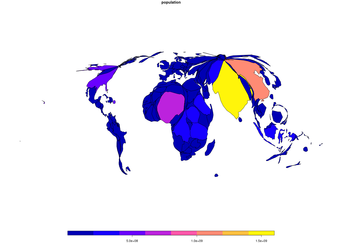
Before we create cartograms of the world, let’s create a single cartogram:
world_data_2100 = world_data %>%
  filter(year == 2100)
world_carto1 = cartogram_cont(world_data_2100, "population", maxSizeError = 1.5)
plot(world_carto1["population"])
The resulting plot was with the awesome sf package, showing what global populations could look like based on recent trends. To make this animated, we need to a) do some more processing (to calculate the cartogram shapes for every year in our sequence) and b) switch to using the awesome tmap package for animated map creation. Note: this next step may take a few minutes.
# warning: this may make your computer's fan spin!
world_data_carto = world_data %>%
  split(.$year) %>%
  map(cartogram_cont, "population", maxSizeError = 1.5) %>%
  do.call(rbind, .)
Visualizing
Animated maps can be created in a single command using the tmap package. Below we pass it the data produced in the previous command:
carto_anim = tm_shape(world_data_carto) +
  tm_polygons("population", title = "Population: ") +
  tm_facets(along = "title", free.coords = FALSE, drop.units = TRUE)
The last step is to save the output object as a .gif file:
tmap_animation(carto_anim, filename = "world_pop_1800_2100.gif", delay = 75,
               width = 1326, height = 942)
If you enjoyed this tutorial you’re in luck: there’s lots more to learn! In addition to chapters on a range of fundamental geographic subjects, there’s an entire chapter on visualization in the online version of Geocomputation with R, which can be found at https://geocompr.robinlovelace.net/ (the physical book will be on sale soon).
Epilogue
There are several things that should be kept in mind about this animation. Firstly, the animation (as well the Gapminder data) shows the world as if all countries always had the borders they have today. This is, of course, untrue, but this simplification allows for the straightforward creation of the animation as well as for an easier understanding of the results. Secondly, the most time-consuming part of the animation creation, constructing continuous area cartograms, can be accelerated, with the use of simplified geometries of the world countries (for example using the rmapshaper package) or with parallel processing (for example using the future or furrr packages). Thirdly, different time steps can be used - an animation could be created for each year, every five years, etc. And finally, cartograms can be animated using a different R package, for example, gganimate, or even combine into an interactive app using shiny.
Footnotes
You can read more about projections in the Reprojecting geographic data chapter of Geocomputation with R.↩︎
Reuse
Citation
@online{nowosad2018,
  author = {Nowosad, Jakub},
  title = {The World (Population) Is Changing},
  date = {2018-10-09},
  url = {https://jakubnowosad.com/posts/2018-10-09-world_pop_change/},
  langid = {en}
}
