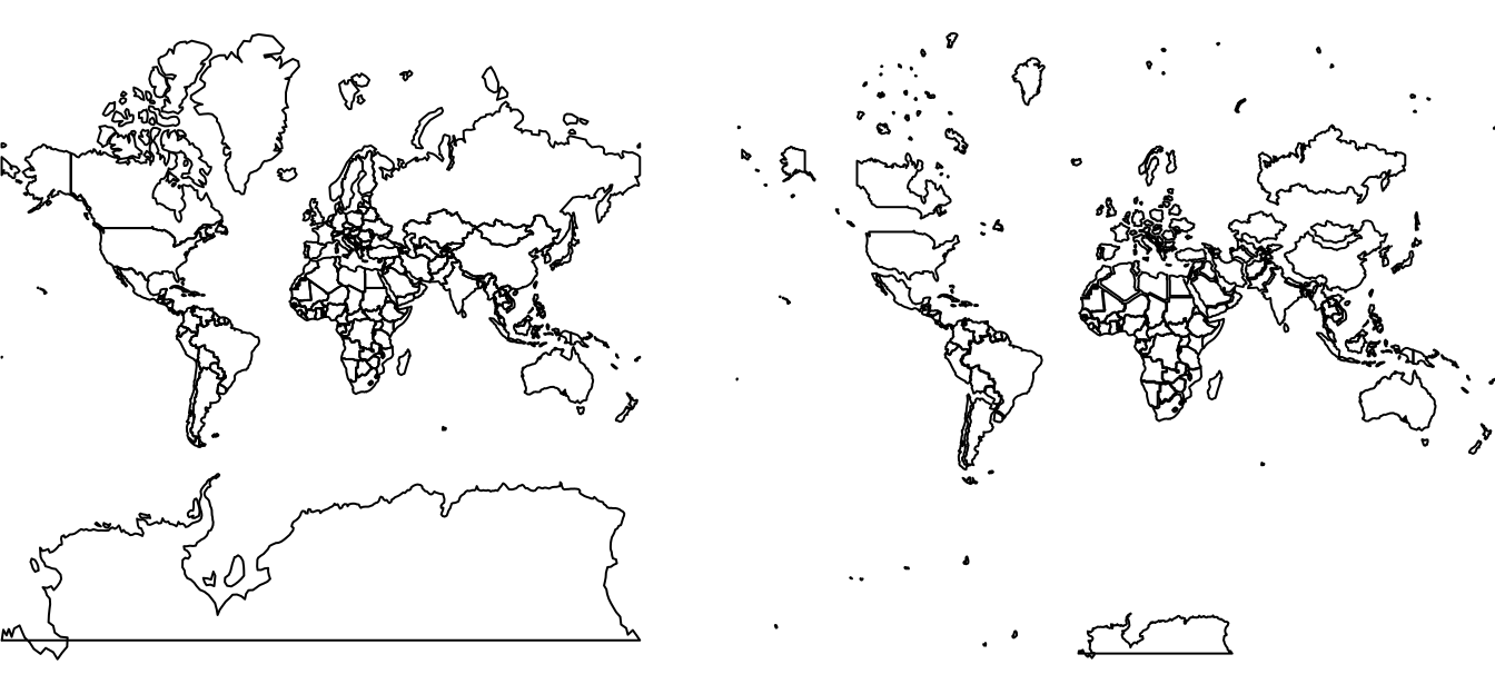
pkgs = c(
  "devtools",       # for install_github
  "sf",             # spatial data classes
  "rnaturalearth",  # world map data
  "dplyr",          # data manipulation
  "purrr",          # data manipulation
  "ggplot2"         # visualisation
)
to_install = !pkgs %in% installed.packages()
if(any(to_install)) {
  install.packages(pkgs[to_install])
}Last week Neil Kaye tweeted:
Animating the Mercator projection to the true size of each country in relation to all the others.
— Neil Kaye (@neilrkaye) October 12, 2018
Focusing on a single country helps to see effect best.#dataviz #maps #GIS #projectionmapping #mapping pic.twitter.com/clpCiluS1z
This, of course, provoked me to ask: is it reproduclible? And more specifically, can it be reproduced in the open source statistical programming language, R?
This post, building on experiences working on the open source and reproducible book project Geocomputation with R, answers both questions with a definitive YES. What follows is a description of how this can be done and, importantly, reproducible code that can be modified to check the distortion of any given projection.
Prepare
Let’s start with installing the necessary packages. We can install the packages hosted on CRAN as follows (note: these and other geographic packages can be installed via the geocompkg ‘metapackage’ with devtools::install_github("geocompr/geocompkg")):
In the case of gganimate and transformr the packages must be installed with install_github() or equivalent because they are not (yet) on CRAN. This can be done as follows:
devtools::install_github("thomasp85/gganimate")
devtools::install_github("thomasp85/transformr")
Now you have the necessary packages, the next step is to attach (aka load) the ones we’ll use:
library(sf)
library(rnaturalearth)
library(dplyr)
library(purrr)
library(ggplot2)
library(gganimate)
Data
Firstly, we need to get the data. The simplest way is to download the map of World’s countries from the Natural Earth project, for example using the rnaturalearth package:
world_orig = ne_countries(returnclass = "sf")We are only interested in the geometries of each country. The select() function is used from the dplyr package to remove all of the columns except those that are needed (the geometry column is kept because the geometry column is ‘sticky’):
world_sel = world_orig %>%
  select()
An additional issue is that some countries consist of multiple islands, some of which can be very far from the capital. For example, the territory of the French Republic includes overseas territories such as French Guiana in South America. sf objects deal with this with the MULTIPOLYGON geometry type: each feature can have multiple polygons, as described in Chapter 2 of Geocomputation with R. To check the distortions on the map, each area needs to be treated independently. To do this we will ‘cast’ the world object into single polygons using the st_cast() function:
world_poly = world_sel %>%
  st_cast("POLYGON")
The last step of data preparation is to transform the object into a new coordinate reference system (CRS), allowing us to visualise area distortions. In my case the projection of interest is Web Mercator (EPSG code of 3857):
world = world_poly %>%
  st_transform(crs = 3857)
However, you can modify it! You could try a different one, for example, crs = 4326.
“Ground truth”
To see how much area we distort using a given projection, we need to know how large it actually is. We can calculate it using one of the equal-area projections, such as the Mollweide projection (+proj=moll), using the st_transform() and st_area() functions:
world_areas = world %>%
  st_transform(crs = "+proj=moll") %>%
  st_area()
Calculate the distortions
Next, we need to know how large each area in our projection is. A tiny trick can be helpful here. We can set our projection to NA and this will cause the st_area() function to calculate areas based on map units, instead of the “real” ones:
map_areas = world %>%
  st_set_crs(NA) %>%
  st_area()
Now we have all the pieces and can calculate the distortions using a simple equation - 1 / (sqrt(MAP_AREAS, TRUE_AREAS)). To keep all the values to be equal to or lower than 1, we can also scale them using the maximum value:
world_scaled = world %>%
  mutate(scale = 1 / (sqrt(map_areas / world_areas))) %>%
  mutate(scale = as.numeric(scale / max(scale)))
The result is a good approximation of the relations between true and distorted areas.
summary(world_scaled$scale)We see that some areas stay the same (values of 1), but some are heavily distorted. Some are even enlarged in our projection more than six times compared with their actual sizes!
1 / min(world_scaled$scale)Map transformation
We have now prepared the data and should be ready to create an animated map. But how can we animate changes in size? We can use affine transformations! To help here we will define a new function that scales geometries relative to a centroid and a scaling factor:
scaler = function(x, y, z) {
  (x - z) * y + z
}
The previous code chunk creates a new function called scaler, that accepts three arguments:
x, a map geometryy, a scaling factorz, a geometry centroid
For more on the topic, we recommend checking-out the Affine transformations section of Geocomputation with R. To generate the centroids used by scaler we will create them with the sf function st_geometry():
world_geom = st_geometry(world)
world_center = st_centroid(world_geom)
Now, we can apply our new function. This can be done with pmap, which accepts a list of our arguments and a function as inputs. Next, we convert the results back to a spatial object:
world_transf = pmap(list(world_geom, world_scaled$scale, world_center), scaler) %>%
  st_sfc(crs = st_crs(world)) %>%
  st_sf()
Note: it is good practice to check intermediary results by plotting them:
plot(world)
plot(world_transf)
Combine two maps
To create an animation, our two objects should have unique ids, and be combined into a single object:
world$state = 1
world_transf$state = 2
worlds = rbind(world, world_transf)
Animate
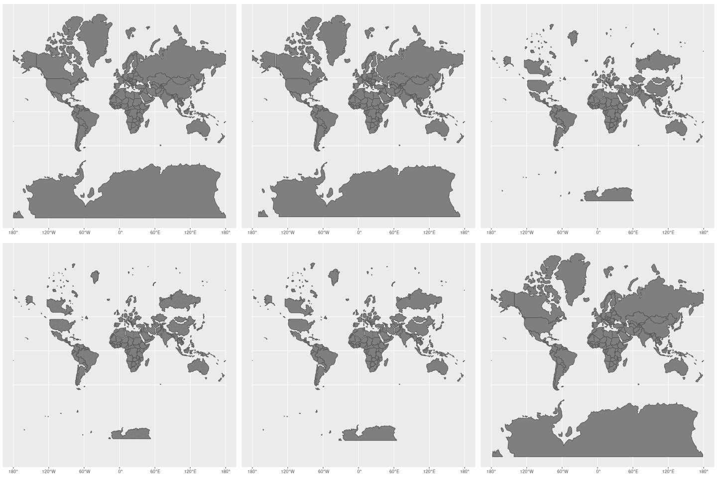
Finally, we can create an animation, for example using the gganimate package. The animation is built using a few functions:
ggplot()to initialize the animationgeom_sf()to plot our maps (and change a color of countries)transition_states()to set that our transition will be based on thestatevariableease_aes()to control the animation
We can render it with the animate() function and save using anim_save().
worlds_anim = ggplot() +
  geom_sf(data = worlds, fill = "grey50") +
  transition_states(state, transition_length = 5, state_length = 2) +
  ease_aes("cubic-in-out")

worlds_animate = animate(worlds_anim, nframes = 20)
anim_save("worlds_animate.gif", worlds_animate)
Now, we can enjoy our result:

Final words
This post has shown not only how to make fun animated maps that demonstrate an important geographic concept (map distortion). It has also demonstrated the ability of the R programming language to do it in a way that is reproducible, allowing others to modify and build-on the work (exercise for the reader: use the code to demonstrate distortions caused by other CRSs).
Reproducibility is vital for scientific research and was a major motivation behind the Geocomputation with R book that has been mentioned throughout this post. If you’re interested in some of the other reasons for doing geographic research with R, check-out Chapter 1. Now is a great time to check-out and get involved-in the book project because, for the first time, we can say that the content is 100% complete!
The animated maps presented here and in my previous post are therefore just some examples of the power of geographic data processing with R. For more examples, please head over to the book’s website, check out the extended articles at geocompr.github.io/ and see the project’s source code at github.com/robinlovelace/geocompr.
Reuse
Citation
@online{nowosad2018,
  author = {Nowosad, Jakub},
  title = {How Much Our Maps Are Distorted?},
  date = {2018-10-16},
  url = {https://jakubnowosad.com/posts/2018-10-23-map-distortion/},
  langid = {en}
}
