
col_ver3 = c("#000000", "#FF0000", "#00CD00", "#0000FF",
             "#00FFFF", "#FF00FF", "#FFFF00", "#BEBEBE")
col_ver4 = c("#000000", "#DF536B", "#61D04F", "#2297E6",
"#28E2E5", "#CD0BBC", "#EEC21F", "#9E9E9E")R version 4.0 is just around the corner. One of the changes in the new version is the improved default color palette using the palette() function.
Proposed colors
The new proposed palette() default is less saturated and more balanced, while at the same time, it follows the same basic pattern of colors (hues). You can read more about it at https://developer.r-project.org/Blog/public/2019/11/21/a-new-palette-for-r/.
library(colorspace)
swatchplot("Version 3" = col_ver3,
           "Version 4" = col_ver4)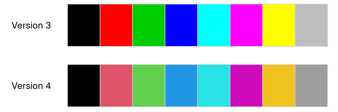
This proposal is still being disussed and modified as mentioned by Achim Zeileis on Twitter:
{{% tweet "1199463785364434944" %}}
Therefore, I decided it is a good time to test the properties of the proposed palette() default for color vision deficiencies - deuteranopia, protanopia, and tritanopia.
Comparision between palettes
I used the colorblindcheck package for this purpose.
# remotes::install_github("nowosad/colorblindcheck")
library(colorblindcheck)
This tiny R package provides tools for helping to decide if the selected color palette is colorblind-friendly. You can see examples of its use at https://nowosad.github.io/colorblindcheck.
The primary function in this package is palette_check(), which creates summary statistics comparing the original input palette and simulations of color vision deficiencies.
palette_check(col_ver3, plot = TRUE)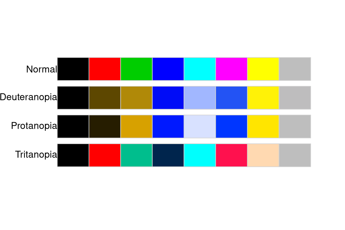
          name n tolerance ncp ndcp  min_dist mean_dist  max_dist
1       normal 8  26.64945  28   28 26.649454  58.57976 105.67883
2 deuteranopia 8  26.64945  28   26 12.790929  51.65788  99.81401
3   protanopia 8  26.64945  28   24  4.337187  54.06193  95.06426
4   tritanopia 8  26.64945  28   23 13.934054  51.49383  90.45153
Visual inspection of the old palette() default allows seeing that it is not suitable for people with color vision deficiencies. For example, people with protanopia could have problems distinguishing the first from the second color and the forth from the sixth color. This problem is also confirmed in the summary statistics, where the minimal distance between colors of the original palette is about 26, while it is only about 4 for protanopia.
palette_check(col_ver4, plot = TRUE)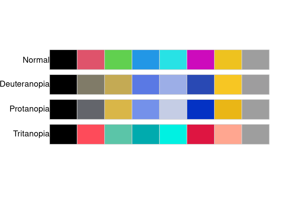
          name n tolerance ncp ndcp  min_dist mean_dist max_dist
1       normal 8  23.51878  28   28 23.518780  50.21307 95.04017
2 deuteranopia 8  23.51878  28   22 12.094062  41.11547 78.45654
3   protanopia 8  23.51878  28   24  5.402646  42.28841 81.02547
4   tritanopia 8  23.51878  28   22 11.032589  44.47677 83.19068
The proposed palette() looks considerably better, as it is easier to distinguish between colors for each color vision deficiency. However, the minimal distance between colors for protanopia is just marginally better with a value of about 5.
Protanomaly
Let’s use the palette_dist() function to compare each pair of colors in the old and proposed palette() using the protanopia color vision deficiency.
palette_dist(col_ver3, cvd = "pro") [,1] [,2] [,3] [,4] [,5] [,6] [,7] [,8]
[1,] NA 13.89 63.29 40.08 85.59 41.23 90.98 66.30
[2,] NA NA 54.81 52.02 82.32 52.17 82.02 62.61
[3,] NA NA NA 78.71 43.28 75.54 18.13 28.28
[4,] NA NA NA NA 52.63 4.34 95.06 52.40
[5,] NA NA NA NA NA 48.08 44.74 14.58
[6,] NA NA NA NA NA NA 91.20 48.37
[7,] NA NA NA NA NA NA NA 31.09
[8,] NA NA NA NA NA NA NA NAThe shortest distance between colors in the old palette() default was between the fourth and sixth color (4.33).
palette_dist(col_ver4, cvd = "pro") [,1] [,2] [,3] [,4] [,5] [,6] [,7] [,8]
[1,] NA 30.25 68.88 53.60 74.53 35.78 71.67 51.95
[2,] NA NA 41.26 27.23 34.35 26.52 43.84 21.75
[3,] NA NA NA 55.72 37.58 78.62 5.40 26.47
[4,] NA NA NA NA 20.76 31.85 58.06 23.89
[5,] NA NA NA NA NA 51.88 39.84 16.37
[6,] NA NA NA NA NA NA 81.03 45.51
[7,] NA NA NA NA NA NA NA 29.48
[8,] NA NA NA NA NA NA NA NAThis pair of colors is substantially more distinguishable in the new proposed palette() default with a distance of about 32. However, the shortest distance in this palette was 5.40 between the third and seventh color.
Summary
The new proposed palette() default is a step in the right direction with more balanced luminance while keeping similar hues to the old version. This constraint, however, results in having a pair of very similar colors for people with protanopia.
What can be done then to ensure that the color palette we use is colorblind friendly? Gladly, there are many additional color palettes available in R that can be used. It includes some of the palettes introduced in the R 3.6 function hcl.colors(). Read more about them at https://developer.r-project.org/Blog/public/2019/04/01/hcl-based-color-palettes-in-grdevices/ or see them by yourself using example("hcl.colors". Additionally, a new palette.colors() function will be added to R 4.0 with several sensible predefined palettes for representing qualitative data.
UPDATE 2019-12-04
The proposed palette() was updated based on the provided feedback and suggestions. The current version is:
col_ver4b = c("#000000", "#DF536B", "#61D04F", "#2297E6",
"#28E2E5", "#CD0BBC", "#F5C710", "#9E9E9E") swatchplot("Version 4b" = col_ver4b)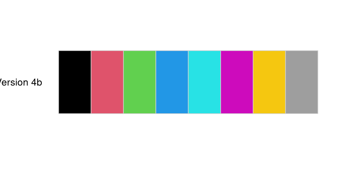
Let’s check how it changes our palette’s summaries:
palette_check(col_ver4b, plot = TRUE) 
          name n tolerance ncp ndcp  min_dist mean_dist max_dist
1       normal 8  23.51878  28   28 23.518780  50.51179 95.04017
2 deuteranopia 8  23.51878  28   22 13.714363  41.47104 81.33288
3   protanopia 8  23.51878  28   24  6.851961  42.56735 81.90781
4   tritanopia 8  23.51878  28   22 11.032589  44.46748 83.19068
The new version is an improvement with a greater distance between the most similar pair of colors for people with protanomaly. It was 4.33 in the version 3 default, 5.4 in the previously proposed version 4 default, and it is 6.85 now. That being said, it is relevant to mention that the evaluation of color palettes cannot be done in an entirely automated fashion: tools in colorblindcheck should be used together with visual judgments.
Reuse
Citation
BibTeX citation:
@online{nowosad2019,
  author = {Nowosad, Jakub},
  title = {Evaluation of the New Palette() for {R}},
  date = {2019-12-01},
  url = {https://jakubnowosad.com/posts/2019-12-01-cbc-bp1/},
  langid = {en}
}
For attribution, please cite this work as:
Nowosad, Jakub. 2019. “Evaluation of the New Palette() for
R.” December 1. https://jakubnowosad.com/posts/2019-12-01-cbc-bp1/.