
library(landscapemetrics)     # landscape metrics calculation
library(raster)               # spatial raster data reading and handling
library(sf)                   # spatial vector data reading and handling
library(dplyr)                # data manipulation
library(tidyr)                # data manipulation
library(tmap)                 # spatial viz
library(geofacet)             # geofacet
library(ggplot2) # geofacetIn the past, I wrote a post on how to calculate landscape-level metrics for local landscapes. There, I showed how to divide the categorical input map into a number of smaller areas and calculate selected landscape metrics for each area. The result consists of a regular grid - a number of square polygons, where each polygon contained just one value of a calculated landscape-level metric (e.g., marginal entropy - ent). This output is easy to visualize on a map - each polygon can be colored accordingly to its value.
There are, although, two more levels of landscape metrics - the class- and patch-levels. Calculation of class-level metrics returns as many values as unique classes in a local landscape, while the patch-level calculations result in as many values as there are patches1 in each polygon. This makes simple visualizations of class- and patch-level metrics not as straightforward as landscape-level metrics. The main goal of this blog post is to present different approaches for visualization of class- and patch-level metrics.
To reproduce the following results on your own computer, install and attach the packages:
Reading the data
The first step is to read the input data. Here, we are going to use example data that is already included in the landscapemetrics package (Hesselbarth et al. 2019).
data("augusta_nlcd")
my_raster = augusta_nlcd
It is also possible to read any spatial raster file with the raster() function, for example my_raster = raster("path_to_my_file.tif")2. However, the input file should fulfill two requirements: (1) contain only integer values that represent categories, and (2) be in a projected coordinate reference system. You can check if your file meets the requirements using the check_landscape() function, and learn more about coordinate reference systems in the Geocomputation with R book (Lovelace et al. 2019).
Our example data looks like that:
plot(my_raster)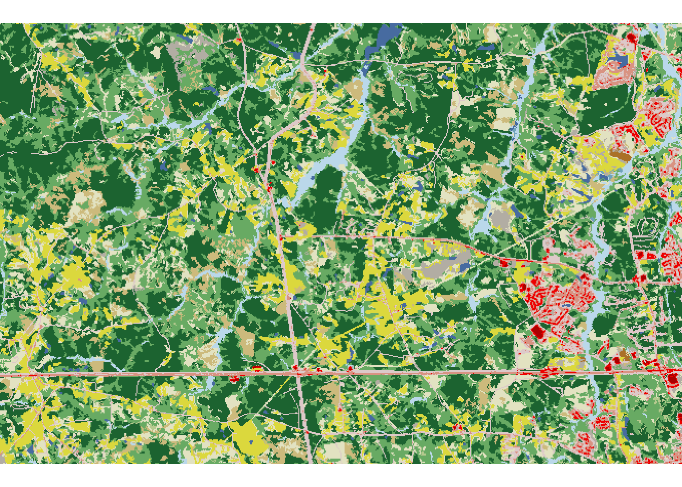
Creating a grid
The next step is to create borders of local landscapes using the st_make_grid() function. This function accepts an sf object as the first argument, therefore we need to create a new object based on the bounding box of the input raster. Next, we also need to provide a second argument, either cellsize or n:
cellsize- vector of length 1 or 2 - the side length of each grid cell in map units (usually meters)n- vector of length 1 or 2 - the number of grid cells in a row/column
my_grid_geom = st_make_grid(st_as_sfc(st_bbox(my_raster)), cellsize = 1500)
my_grid_template = st_sf(geom = my_grid_geom)
We should also add a unique identification number (id) to each grid cell (local landscape).
my_grid_template$plot_id = seq_len(nrow(my_grid_template))Next, we can overlay the newly created grid on top of our input raster:
plot(my_raster)
plot(st_geometry(my_grid_template), add = TRUE)
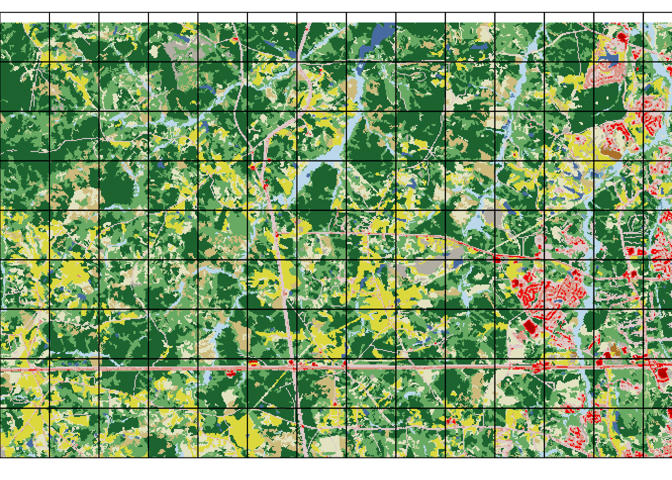
Note that some cells cover smaller areas with data than the others.
Calculating a class-level metric
The calculation of landscape metrics for each cell can be done with the sample_lsm() function. It requires an input raster as the first argument, and a grid as the second one3. The function calculates the selected landscape metric independenly for each cell. Next, we can specify which landscape metrics we want to calculate. For this example, we use aggregation index (ai) to be calculated on a class level^[The complete list of the implemented metrics can be obtained with the list_lsm() function. Let us know if you are missing some metrics.
my_metric1 = sample_lsm(my_raster, my_grid_template,
                       level = "class", metric = "ai")
my_metric1
# A tibble: 1,313 × 8
layer level class id metric value plot_id percentage_inside
<int> <chr> <int> <int> <chr> <dbl> <int> <dbl>
1 1 class 11 NA ai 83.3 1 100
2 1 class 21 NA ai 34.5 1 100
3 1 class 22 NA ai 23.0 1 100
4 1 class 31 NA ai 86.8 1 100
5 1 class 41 NA ai 63.9 1 100
6 1 class 42 NA ai 73.2 1 100
7 1 class 43 NA ai 39.5 1 100
8 1 class 52 NA ai 43.1 1 100
9 1 class 71 NA ai 66.9 1 100
10 1 class 81 NA ai 85.8 1 100
# … with 1,303 more rowsEach row in the my_metric object corresponds to one calculated value of ai, while the plot_id column specifies to which grid cell the results are related 4. Because there are several classes in each cell, there are also several ai values for each cell present. Next, we can connect spatial grid (my_grid_template) with the calculation results (my_metric1) using the left_join() function:
my_grid1 = left_join(my_grid_template, my_metric1, by = "plot_id")Vizualizing the class-level results
For the class-level results, each local landscape has as many values as unique classes belong to it. It prevents us from creating a single comprehensive map, but, on the other hand, allows for some other visualizations.
Subsets
The most basic approach is to create a map just for a selected class, which can be done with the subset() function:
my_grid1_class1 = subset(my_grid1, class == 11)
plot(my_grid1_class1["value"])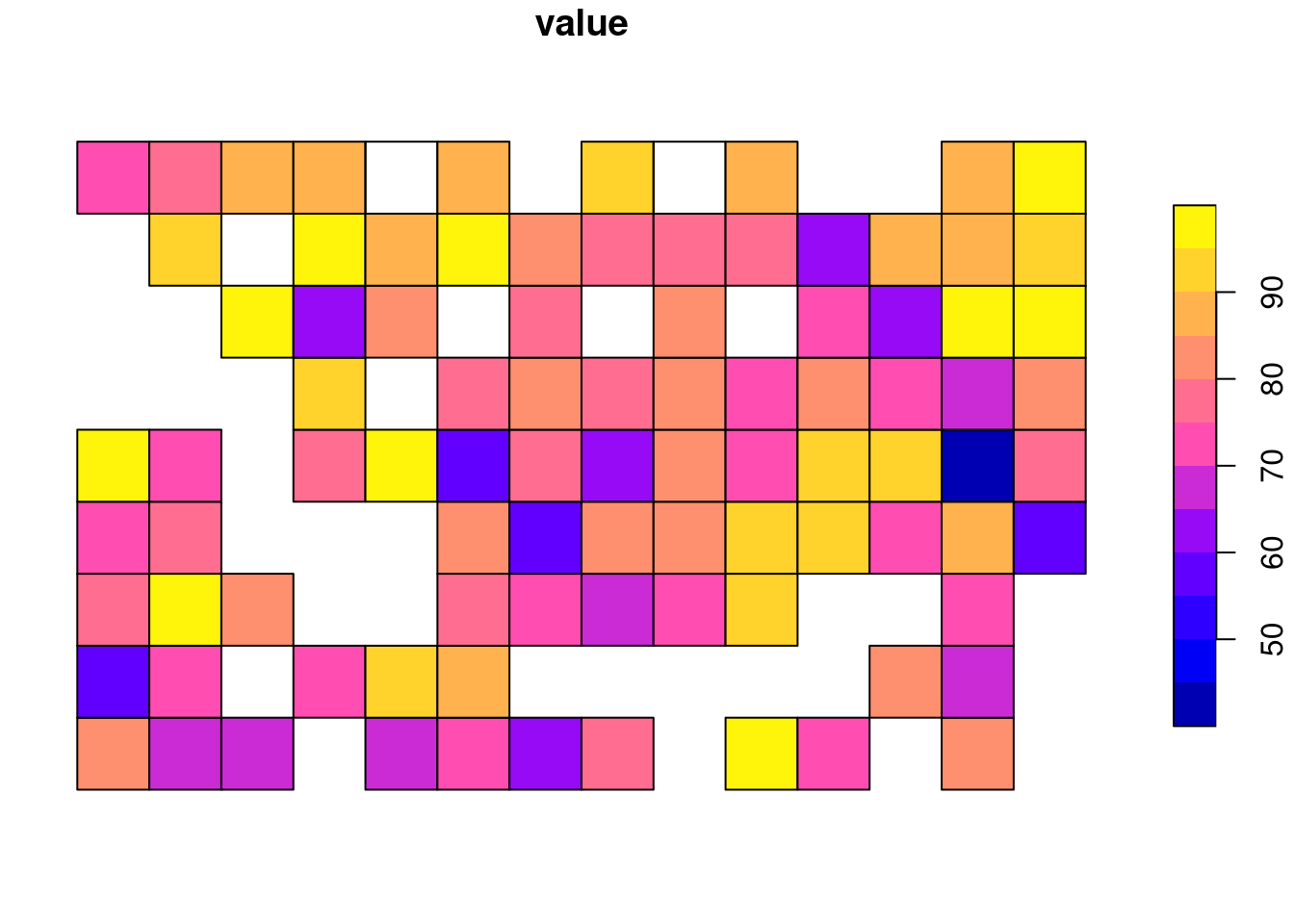
The above plot shows the distribution of ai values for class 11.
Map facets
It is also possible to quickly visualize all of the subsets at the same time with the tmap package (Tennekes 2018).
tm_shape(my_grid1) +
  tm_polygons("value", style = "cont", title = "ai") +
  tm_facets(by = "class", free.coords = FALSE)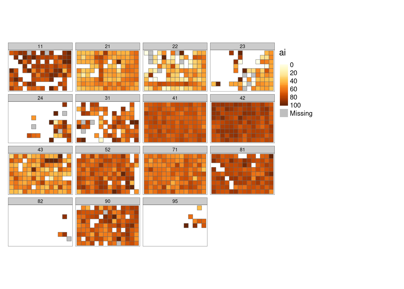
The result here contains a separate panel for each unique class in our dataset, while colors represent different AI values.
geofacet
As our local landscapes are made of a regular grid, we can also test some less traditional visualizations. One possibility is to use the geofacet package (Hafen 2020) - it allows to create many regular plots (such as histograms, scatterplots, boxplots, etc.), but arrange them spatially. Visit the package website at https://github.com/hafen/geofacet to find more examples.
The first step here is to create a plotting grid with grid_auto():
grd = grid_auto(my_grid_template, names = "plot_id")Next, we can create a plot with the ggplot2 syntax (Wickham 2016) adding facet_geo(~plot_id, grid = grd) to it:
ggplot(my_grid1, aes(as.factor(class), value, fill = as.factor(class))) +
  geom_col() +
  facet_geo(~plot_id, grid = grd) +
  labs(x = NULL, y = "ai", fill = "Class") +
  theme(axis.text.x = element_blank(),
        axis.ticks.x = element_blank(),
        strip.background = element_blank(),
        strip.text.x = element_blank())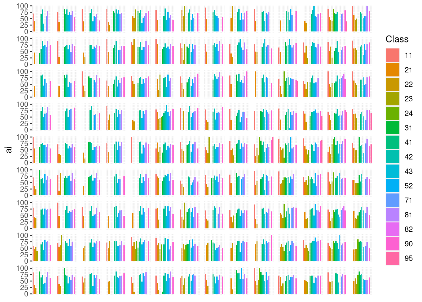
Here, we can see a visualization that consists of many separate bar plots. Each bar plot represents ai values for each local landscape.
Calculating a patch-level metric
The calculation of patch-level metrics can also be done with the sample_lsm() function. In this example, we use euclidean nearest-neighbor distance (enn) - a metric that can only be calculated on a patch level.
my_metric2 = sample_lsm(my_raster, my_grid_template,
                       level = "patch", metric = "enn")
my_metric2
# A tibble: 10,479 × 8
layer level class id metric value plot_id percentage_inside
<int> <chr> <int> <int> <chr> <dbl> <int> <dbl>
1 1 patch 11 1 enn 201. 1 100
2 1 patch 11 2 enn 201. 1 100
3 1 patch 11 3 enn 495. 1 100
4 1 patch 21 4 enn 433. 1 100
5 1 patch 21 5 enn 67.1 1 100
6 1 patch 21 6 enn 67.1 1 100
7 1 patch 21 7 enn 67.1 1 100
8 1 patch 21 8 enn 67.1 1 100
9 1 patch 21 9 enn 60 1 100
10 1 patch 21 10 enn 60 1 100
# … with 10,469 more rowsThe result contains a large number of rows, where each row is related to a unique combination of a patch, a class, and a grid cell. We can connect spatial grid (my_grid_template) with the calculation results (my_metric2) again using the left_join() function:
my_grid2 = left_join(my_grid_template, my_metric2, by = "plot_id")Vizualizing the patch-level results
Visualization of the patch-level results could be the most challenging to create. Here, each local landscape can have as little as one value (a single large patch) and as many values as cells. Patches also can be related to just a few or to many different classes.
One patch map
The most straightforward approach here is to use the spatialize_lsm() function, which calculates a selected patch-level metric for a given raster, and returns a new raster with the metric values.
my_metric_r_all = spatialize_lsm(my_raster, level = "patch", metric = "enn")The output of spatialize_lsm() is a nested list. Each list element is used to represent different input layers (e.g., land cover data for different years), while each sub-list element relates to the calculated metric (you are able to calculate many metrics at the same time).
plot(my_metric_r_all$layer_1$lsm_p_enn)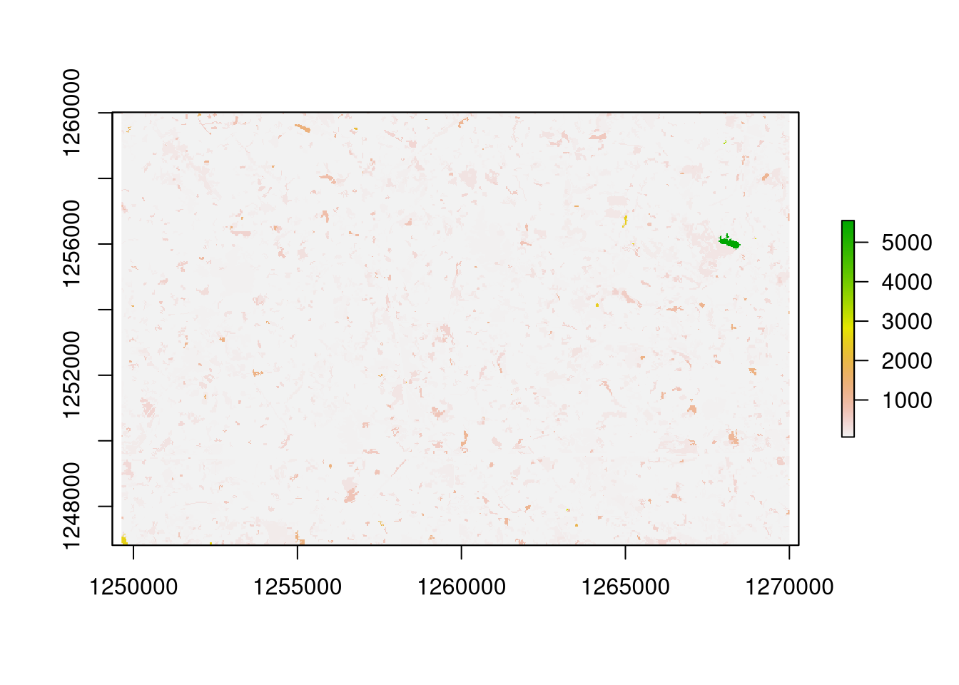
The spatialize_lsm() function is fine when we need to present patch-level values for a whole raster. However, if we have many local landscapes (or sub-rasters) then we need to repeat the spatialize_lsm() calculations for each area.
Patch maps
This can be done with the help of the following code.
patch_raster = function(my_raster, my_grid){
  result = vector(mode = "list", length = nrow(my_grid))
  for (i in seq_len(nrow(my_grid))){
    my_small_raster = crop(my_raster, my_grid[i, ])
    result[[i]] = spatialize_lsm(my_small_raster,
                                 level = "patch", metric = "enn")
  }
  return(result)
}

my_metric_r = patch_raster(my_raster, my_grid_template)
my_metric_r = unlist(my_metric_r)
names(my_metric_r) = NULL
my_metric_r = do.call(merge, my_metric_r)
In it, we go through each grid cell, crop a raster to its extent, and calculate our metric of interest. The result is a large list consisting of many separate small rasters, that we can combine to get a full-size raster in return with do.call() and merge().
plot(my_metric_r)
plot(st_geometry(my_grid_template), add = TRUE)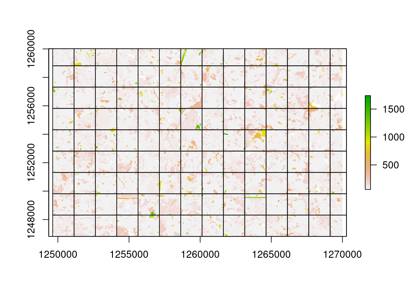
The resulting visualization looks much different from the previous one. In it, each local landscape is treated independently, therefore, a patch belonging to many grid cells is split into many patches.
Summary
The landscapemetrics package, together with many other open-source R packages, allows for spatial visualizations of class- and patch-level metrics. The class-level metrics can be presented independently for each class, or as a geofacet plot, while patch-level metrics might be visualized in combination with the spatialize_lsm() function. It is also worth to mention that patch-level metrics can also use the geofacet package; however, this could work best when the number of local landscapes is relatively small. Otherwise, the resulting plot could be hard to read. To learn more about landscape metrics and the landscapemetrics package, visit https://r-spatialecology.github.io/landscapemetrics/ and http://dx.doi.org/10.1111/ecog.04617.
Acknowledgement
Many thanks to Maximilian H.K. Hesselbarth for reading and improving a draft of this blog post.
References
Hafen, Ryan. 2020. Geofacet: ’Ggplot2’ Faceting Utilities for Geographical Data. https://CRAN.R-project.org/package=geofacet.
Hesselbarth, Maximilian H. K., Marco Sciaini, Kimberly A. With, Kerstin Wiegand, and Jakub Nowosad. 2019. “Landscapemetrics: An Open-Source r Tool to Calculate Landscape Metrics.” Ecography 42: 1648–57.
Lovelace, Robin, Jakub Nowosad, and Jannes Muenchow. 2019. Geocomputation with R. CRC Press.
Tennekes, Martijn. 2018. “tmap: Thematic Maps in R.” Journal of Statistical Software 84 (6): 1–39. https://doi.org/10.18637/jss.v084.i06.
Wickham, Hadley. 2016. Ggplot2: Elegant Graphics for Data Analysis. Springer-Verlag New York. https://ggplot2.tidyverse.org.
Footnotes
A patch is a group of adjacent cells of the same category.↩︎
Currently landscapemetrics accepts also objects from the terra and stars packages.↩︎
This function also allows for many more possibilities, including specifying a 2-column matrix with coordinates, SpatialPoints, SpatialLines, SpatialPolygons, sf points or sf polygons as the second argument. You can learn all of the valid options using
?sample_lsm.↩︎To learn more about the structure of the output read the Efficient landscape metrics calculations for buffers around sampling points blog post.↩︎
Reuse
Citation
BibTeX citation:
@online{nowosad2022,
  author = {Nowosad, Jakub},
  title = {How to Visualize Landscape Metrics for Local Landscapes?},
  date = {2022-02-17},
  url = {https://jakubnowosad.com/posts/2022-02-17-lsm-bp3/},
  langid = {en}
}
For attribution, please cite this work as:
Nowosad, Jakub. 2022. “How to Visualize Landscape Metrics for
Local Landscapes?” February 17. https://jakubnowosad.com/posts/2022-02-17-lsm-bp3/.